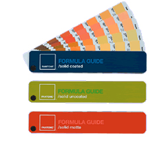
“Creating More Natural Digital Colors”
For many, the switch to digital illustration is one that takes some getting used to. One of the issues that often comes up is how to get the same natural colors which traditionally came from mixing paint colors. Here are some tips on setting up your palate for a digital painting. Also, check out this article on the differences between RGB screen color vs CMYK process print color.
I find that you really need to look closer at actual colors in small blocks. If you are painting a shadow on the snow for example, take a close look at that shadow in real life first. Remember your traditional training and get out there and do some live paint sketches. Forget for a moment what the subject is that you are looking at and look only at a small area of the object, (such as a shadow in the snow) as if you were going to match a paint swatch. You may be surprised to find out that you will have to add an awful lot of blue in there that you never thought was there. Our minds want to believe that a color should be what we think it is.

Here is a closer look at choosing colors.
If you work from photos, you can try this experiment… Grab a JPG file of any photo that you like. In Photoshop, use your eye-dropper tool to select from a small area on an object in the photo. You may have to select a few times since you may be selecting from a tiny pixel that is actually darker or lighter than the pixel next to it in the same color area. Select with the eye dropper until the color block in your tool palate shows a swatch that pretty much matches the overall look of the object. Now you have a starting point for painting in your base color for that object. Add this color to your set up palate that you are building. Select from various objects and areas of the image, filling the color blocks in your pallet until you feel you have enough colors, (digital paint) to work with.
Check out some great tips and watch illustrator Jason Seiler paint digitally in his Schoolism Class.
Below you can see the differences in color appearance between RGB and CMYK digital color especially in the greens and reds. RGB version is on the left and the CMYK version on the right.
(Deystudio images from Getty Images and istockphoto.com)It’s usually a good idea to set up your color palate before beginning work on a painting, (the same as in traditional painting). I create a separate pallet file and fill square blocks of color with the basic color theme I will be using. There are color swatch sample themes on websites such as Kuler But I like to create my own. Sometimes I will pick colors from a photo image that I particularly like the feel or mood of. I will use the eye dropper tool to select from various areas of the image, creating my color palate based on the color theme of the photo. Photoshop allows for you to make adjustments to your color but it will work out best if you start your painting using the colors that are as close to what you are looking for. You will want to keep in mind the end use for the image. If it will be reproduced for printing purposes such as a children’s picture book, you will want to work in CMYK mode. If you work in RGB mode on an image that will be in print, you will wind up with a completely different look to the color when you convert it later from RGB to CMYK. Avoid the surprises and start out in CMYK. Happy painting!
Lorraine Dey
(click on the “about” tab above to see more about Deystudio, LLC)
FREE Vector of the month from Deystudio, LLC:
click on image above to get a PDF file.
This month’s featured site…”EFII”
A central hub for illustration resources.


Lovely blog you have here, Lorraine, and you do beautiful work as well. Belated congrats on scoring your first picture book as author and illustrator– a tremendous achievement!
Cheers, Mark
Thank you for the congrats Mark. Next month’s blog will be about the process and my progress on the book so far. 🙂
Hi Lorraine,
I love your blog so much that I nominated you for a Sunshine Award! Congrats on the new Raven Tree Book. I’m illustrating a book for them as well that will be out in Spring of next year.
Happy drawing,
T.