Illustration Portfolio Workshop

I was able to attend a great workshop this past weekend. NJ SCBWI organized this event with Laurent Linn, (Art Director at Simon & Schuster), and Pat Cummings, (Professor at Pratt Institute and Illustrator of many picture books).

LaurentLinn

Above: Left to right, Beth Bogert, Laurent Linn, Doris Ettlinger
 

My goal in attending this workshop was to try to find out where my work fits in, and how best to market my style. I went into the workshop with all of my work and sketches all put together in my portfolio. I found out so much valuable information from these two very generous professionals. Here is what I wrote to Karen Romagna, who organized this event along with Leeza Hernandez, (NJ SCBWI RA)…

Great event! Thank you so much to everyone!! There was so much information that was gained all day long.

It was a huge benefit to be able to hear feedback and see other portfolios, we definitely gained from being able to do this as a group.

Before this event I was growing more and more confused as to which direction to take my work and portfolio. I have heard from so many professionals, agents, etc. that my style wasn’t what they were looking for.

After spending the day with Pat Cummings and Laurent Linn, I now have a much better understanding of exactly what that means as far as Mass Market vs Trade, and I have a definite direction…AND alot of work ahead of me!! 😉 I now know that I need to stop marketing my mass market style to trade professionals for one thing! Ah-ha moment! 😉

LDey_illustrationstyles

Above: An example of what might show the two styles, mass market on left and a much softer trade style on the right.
 

I also realized that I needed to change my attitude about my website, and quick! I have been leaving my updating as a last resort for the day that i will “have some time”…of course that never happens! After this workshop I am realizing that my website image-updating needs to be my number one priority! The website is basically the sole representation of your work these days. There aren’t many one on one physical portfolio viewings anymore. Great big wake up call for me!! Thanks again for setting up this important event.

Pat suggested purchasing a catalog from the Society of Illustrators children’s book art exhibit, (which i did right away).

CoverWEB

Lorraine Dey

http://www.deystudio.com

A book-in-the-works!

I am taking on another book project. I am currently sketching out the page illustrations for a book I am working on.  It features “Jodie”, a little tiger cat that has no stripes!?! This sketch from the preliminary pages is perfect for this week’s IF image.  The topic is “Separated”. Look for more on Jodie coming very soon. 🙂

Look for more on “Jodie” and the new book…”My Cat Wears Blue” by Lorraine Dey.

Happy Holidays! Thanks for stopping in. 🙂

Lorraine

www.deystudio.com

Vector vs Raster digital Art

Vector vs Raster digital Art

This month I thought I’d talk a little about the differences of digital vector art and digital raster art and why I choose one style over the other when illustrating a project.  Most of my children’s book art is done in Adobe Photoshop as raster digital files.  I choose this style for a more painted look to the finished art.  Using a Wacom tablet and stylus pen, I literally paint the image in a style of brush strokes similar to my traditional painting style in hopes of not looking too digitally produced. 

Pages 6 and 7 from a picture book, “The Rain Forest Party” written and illustrated by Lorraine Dey and available in the Fall of 2011 from Raven Tree Press.

I almost always create a pencil sketch first.  Then I scan the sketch to a digital JPG file on the computer and use the sketch as a basis for painting in the color and details in layers over the sketch.  Most of the work I create for istockphoto as royalty-free licensed art is done as a vector digital file.  I create a large amount of work in vector style with Adobe Illustrator CS for freelance clients as well.  Here is a vector chef that was commissioned by T.Marzetti Company for use on their website as well as large display signs.  A vector file is scalable to any size without losing clarity therefore it was a perfect choice for this project.  The style was requested by the client.

Both styles will begin as a sketch that is scanned into the computer before beginning final work on the illustration.  Vector art is perfect for technical and educational work such as instructional illustrations and charts.  The clean, sharp edges and ability to scale to any size make it ideal for everything from web icons to full size bill boards or vehicle graphics.

Here is a tutorial on using the Pen Tool in Adobe Illustrator… The basics of vector illustration.

Here is a quick and simple vector tutorial video…Light Ribs.

Here is a high-speed video of a raster digital painting being produced… Spider Man.

For more instruction on creating digital illustration images in various programs try a visit to Lynda.com   Enjoy!

Lorraine Dey

illustrator – Deystudio, LLC (www.deystudio.com)
(click on the “about” tab above to see more about Deystudio, LLC)
_____________________________________________________________________
 

FREE Vector of the month from Deystudio, LLC:

click on image above to get a PDF file.

_________________________________________________________________
 

This month’s featured site…”The Association of Illustrators”

A resource for illustrators.

 
_________________________________________________________________
 

Featured image for this month…(from my RF stock portfolio)

“Creating More Natural Digital Colors”

“Creating More Natural Digital Colors”

For many, the switch to digital illustration is one that takes some getting used to.  One of the issues that often comes up is how to get the same natural colors which traditionally came from mixing paint colors.   Here are some tips on setting up your palate for a digital painting.  Also, check out this article on the differences between RGB screen color vs CMYK process print color.


I find that you really need to look closer at actual colors in small blocks.  If you are painting a shadow on the snow for example, take a close look at that shadow in real life first.  Remember your traditional training and get out there and do some live paint sketches. Forget for a moment what the subject is that you are looking at and look only at a small area of the object, (such as a shadow in the snow) as if you were going to match a paint swatch.  You may be surprised to find out that you will have to add an awful lot of blue in there that you never thought was there.  Our minds want to believe that a color should be what we think it is.


Here is a closer look at choosing colors

If you work from photos, you can try this experiment…  Grab a JPG file of any photo that you like.  In Photoshop, use your eye-dropper tool to select from a small area on an object in the photo.  You may have to select a few times since you may be selecting from a tiny pixel that is actually darker or lighter than the pixel next to it in the same color area.  Select with the eye dropper until the color block in your tool palate shows a swatch that pretty much matches the overall look of the object.  Now you have a starting point for painting in your base color for that object.  Add this color to your set up palate that you are building.  Select from various objects and areas of the image, filling the color blocks in your pallet until you feel you have enough colors, (digital paint) to work with.

Check out some great tips and watch illustrator Jason Seiler paint digitally in his Schoolism Class.

Below you can see the differences in color appearance between RGB and CMYK digital color especially in the greens and reds.  RGB version is on the left and the CMYK version on the right.

(Deystudio images from Getty Images and istockphoto.com)

It’s usually a good idea to set up your color palate before beginning work on a painting, (the same as in traditional painting).  I create a separate pallet file and fill square blocks of color with the basic color theme I will be using.  There are color swatch sample themes on websites such as Kuler  But I like to create my own.  Sometimes I will pick colors from a photo image that I particularly like the feel or mood of.  I will use the eye dropper tool to select from various areas of the image, creating my color palate based on the color theme of the photo.  Photoshop allows for you to make adjustments to your color but it will work out best if you start your painting using the colors that are as close to what you are looking for.  You will want to keep in mind the end use for the image.  If it will be reproduced for printing purposes such as a children’s picture book, you will want to work in CMYK mode.  If you work in RGB mode on an image that will be in print, you will wind up with a completely different look to the color when you convert it later from RGB to CMYK.  Avoid the surprises and start out in CMYK.  Happy painting!

Lorraine Dey

illustrator – Deystudio, LLC (www.deystudio.com)
(click on the “about” tab above to see more about Deystudio, LLC)
_____________________________________________________________________
 

FREE Vector of the month from Deystudio, LLC:

click on image above to get a PDF file.

_________________________________________________________________
 

This month’s featured site…”EFII”

A central hub for illustration resources.

 
_________________________________________________________________
 

Featured image for this month…(from my RF stock portfolio)

Creating Story Boards and Picture Book Dummies

Creating Story Boards and Picture Book Dummies

In my last post I mentioned that I had submitted my first written manuscript to the publisher.  Well it looks like this year I will be starting out 2010 as an author/illustrator!  Happy New Year!

Raven Tree Press has contracted my book “Hector-Armando’s Big Rain Forest Party”, (working title).  It is scheduled for a Fall 2011 release and I will be spending this year creating all of the illustrations for this book about a little armadillo.   I plan to keep a journal as both the author and illustrator, and will include information on the “process” in future posts.  This first post is where I start working… the rough story boards and cover designs

This means I have to come up with sketches of the scenes to be depicted on each spread and also the front and back covers.  I will put the roughs together following the page sequence  that they are to appear in the book.  This small mini version of the book is called a book dummy or mock-up.  I had been making sketches and little rough scribbles as I was writing the book.  Now I need to bring it to the next level so the publisher can see what I have in mind for the entire book layout.   Here’s an interesting look into the process and  What Happens inside a Children’s Publishing Company.

(This is a very rough initial draft of a cover possibility and it will likely change before the final art is produced).

Here is my journaling so far for anyone interested in how this whole process looks and how long it takes…

Dec. 21, 2009 – Submitted manuscript to publisher. (This is a publisher I have already worked with.  It would take much longer if you are submitting to a new publisher)

Jan. 12, 2010 – Received an email from publisher… Lorraine,
“Exciting news!  People at our home offices love your book proposal. I have just gotten a green light to offer you a contract for the book and to establish a production schedule with you.” 

 My Schedule:  The first thing I will need to focus on now is finalizing the rough story boards and book dummy.  If I were to have submitted this manuscript to a publisher I never worked with before, I would have created a dummy book to submit along with the manuscript.  And possibly a finished spread or two to go along with it.

Feb. 28th – Rough covers and story boards are due to the publisher
Mar. 15th – Final cover art is due to the publisher
April 15th – Final Illustrated spreads 1 – 3, (pages 3 to 7) due to publisher
Aug. 15th – Final Illustrated spreads 4 – 7, (pages 8 to 15) due to publisher
Sept. 30th – Final Illustrated spreads 8 – 11, (pages 16 to 23) due to publisher
Nov. 15th – Final illustrated spreads 12 – 16, (pages 24 to 32) due to publisher
Fall 2011 – One year later, the tentative publishing release date for “Hector-Armando’s Big Rain Forest Party”

I am very excited to illustrate my very own picture book this year.  I look forward to sharing the progress with you here on my blog each month.  For a look at my first illustrated picture book that I completed last year, “A Sweater for Duncan”, visit the FB fan page. 

Lorraine Dey
illustrator – Deystudio, LLC (www.deystudio.com)
(click on the “about” tab above to see more about Deystudio, LLC)
_____________________________________________________________________
 

FREE Vector of the month from Deystudio, LLC:

click on image above to get a PDF file.

_________________________________________________________________
 

This month’s featured site…”Illustration Friday”

A weekly opportunity for Illustrators to showcase their work.

_________________________________________________________________
 

Featured image for this month…(from my RF stock portfolio)


“Working With a Development Editor.”

“Working With a Development Editor.”

Many picture book illustrators decide to try their hand at writing the manuscript as well as illustrating a picture book.  I took that plunge this Fall and created a manuscript for a picture book with a working title of “Hector-Armando’s Big Rain Forest Party”. 

sneak-preview sketch… 

Since this was my first attempt at writing one, I hired a development editor to help me in making sure the plot, characters, and narrative, all flowed properly.  I contacted Simone Kaplan who was very easy to work with.  For me, the use of an editor was crucial and in working with Simone, I gained a great deal of insight into the writing process and learned so much from her.  Thank you Simone!

NOTE: I have submitted the manuscript to the publisher and will let you know as soon as I hear any news, (good or bad).  Wish me luck!

There are several different types of editors you can hire to help finalize and polish your story.  Since I had a particular publisher in mind when creating this manuscript, I felt that I needed to concentrate more on the actual structure of the book.  A copy editor will correct things like punctuation, spelling, etc. but the publisher I am focused on already has a copy editor and so I needed to use more of a development editor for help with the foundation of the story and characters.

I came across this old SCBWI France Interview with Simone when she was still working as an editor at Harper Collins in 2001. (though I’m not sure she’ll appreciate me pulling this from the dust pile).

Here is some valuable information on getting your manuscript read and out of the publisher’s slush pile.  This is a helpful article by another editor, Harold Underdown.

And here is a great article on what editor Cheryl Klein  likes to see in an artist’s portfolio. Also, Cheryl has a great post on “How to write a query letter”.

Don’t be afraid to use an editor for your first manuscript.  It is well worth the effort. 

Lorraine Dey
illustrator – Deystudio, LLC (www.deystudio.com)
(click on the “about” tab above to see more about Deystudio, LLC)
_____________________________________________________________________
 

FREE Vector of the month from Deystudio, LLC:

click on image above to get a PDF file.

_________________________________________________________________
 

This month’s featured blog…”Children’s Publishing”

Children’s Publishing information from Scot Franson.

_________________________________________________________________
 

Featured image for this month…(from my RF stock portfolio)


“SCBWI Illustrator’s Day – Critiques and Learning”

“SCBWI Illustrator’s Day – Critiques and Learning”

I just returned from a full day of critiques, portfolio reviews and meetings with agents & art directors at the Society of Children’s Book Writers and Illustrators – “Illustrator’s Day” in Princeton, NJ.  It was a very productive learning day for me.  I love doing the SCBWI events because I always come away with so much valuable information and it’s great to connect with others in the field.


The above image was the “before” illustration completed as a 2 page spread assignment for the group critique. I chose to work from a book called “The Critter Sitter”, originally beautifully illustrated by Chuck Richards. I didn’t look at Chuck’s book until after I did the illustration because I didn’t want to be influenced at all.

Art Director Donna Mark, (Bloomsbury/Walker Publishing) was my assigned mentor and some of the comments and suggestions from her as well as the other illustrators in the group were as follows:

1.Not sure that the dark purple background is working. Possibly make it look more like a kitchen background or lighten it up.

2.The boy, Henry is too small and disproportionate to the door, as well as the proportions of the frog and cat in the foreground.

3.The dog is at an angle that looks like he is not running out of the door but staying inside the house.

So here is my attempt at fixing some of the problems…

Here is the first sketch that was initially submitted to the Art Director for review before starting any painting…

Donna suggested that I include much more to the scene since there was so much going on in the text for this page spread.  I revised the sketch several times to try to include the dog as well.  In addition to the critique, there was a great workshop for illustrators given by Leeza Hernandez, and I also got to meet with agent Christina Tugeau.  Great tips and helpful suggestions were gained from both.  I look forward to the next Illustrator’s Day event with NJ SCBWI.

Lorraine Dey
illustrator – Deystudio, LLC (www.deystudio.com)
(click on the “about” tab above to see more about Deystudio, LLC)
_____________________________________________________________________
 

FREE Vector of the month from Deystudio, LLC:

click on image above to get a PDF file.

_________________________________________________________________
 

This month’s featured website or blog…”Patch Together”

See your designs and illustrated characters turn into actual product!

_________________________________________________________________
 

Featured image for this month…(from my RF stock portfolio)


“Picture Books – The Illustrator’s Process”

“Picture Books – The Illustrator’s Process”

Since I began promoting myself in the area of Children’s Book Illustration, I have had a number of people inquire about providing illustrations for their “book that they have written and always wanted to publish”.  I decided to put together some resource information for this month’s topic to shed some light on the process a picture book illustrator may go through. 

book_mockup1 book_mockup2

I hope to also dispell the myth that as a writer you need to hire an artist and have the illustrations completed to submit along with your written manuscript.  Here’s what I tell people that ask me about illustrating a book they are interested in getting published… “Send the manuscript to the publisher, without illustrations.  It will be judged on it’s own merit and if the publisher is interested, they will find an illustrator that fits the project, …that’s just how it’s done”.

Instead of going into any more detail, there is a great article on that subject here at Harold Underdown’s site, The Purple Crayon 

Since publishers are looking to match-up illustrators with manuscripts that they like, an illustration project for a picture book will most-likely come directly from an editor or art director at a publishing house.  The publisher may send a manuscript to several illustrators at the same time and ask for a sample page or two in order to select the exact style they are looking for.  At that point they will narrow their selection down to one illustrator.

From the Illustrator’s side…

Once they decide on an illustrator, a contract is drawn up between the illustrator and publisher containing details of due dates, royalties, etc.  If you don’t have an agent working with you on this it is a good idea to have an IP, (intelectual property) attorney take a look at it for you.  Once all the legal stuff is out of the way the illustrator starts sketching and preparing a sketch “dummy” of the book.  It’s a rough mini-version of the book page layout.  This helps to see how the book flows from page to page and helps in laying out color and text position.  Make sure to check with the publisher for specifics on the book size dimensions and how many pages, etc.  Typically that is around 28-32 pages with between 500-800 words for a picture book, (max is 1000).  Rough sketches of the page spreads are submitted to the publisher first before any color work is started.  Once you get the go-ahead on the sketches, it’s time to add the color.  Here is a bit more information and sample layout of the pages for a picture book from Kathy Temean’s blog.

Dey_Sketch1  Dey_Duncan  

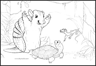
From “A Sweater for Duncan” – To be published by Raven Tree Press .


Personally, I like to add one more step in there and do a “color” rough that shows the publisher what you have in mind.  The color mock up shown at the beginning of this article was put together using print-outs of the color roughs that were sent to the publisher.  I use this mock up, (complete with numbered pages) throughout the entire time I am working on the final illustrations in order to keep everything organized.  Once the illustrations are finalized and sent to the publisher, you can be sure there will be some changes, (much easier to do if you are working digitally).  The publisher then produces the book, usually within about 6 months to a year.  You can be sure I will post the announcement here when “A Sweater for Duncan” is released next Fall.  🙂

See all current news and release date info. for “A Sweater for Duncan”  

Lorraine Dey
illustrator – Deystudio, LLC (www.deystudio.com)
(click on the “about” tab above to see more about Deystudio, LLC)
_____________________________________________________________________
 

FREE Vector of the month from Deystudio, LLC:

coffee_cup

click on image above to get a PDF file.

_________________________________________________________________
 

This month’s featured website or blog…”illustrator Sahin Ersoz”

I came across Sahin Ersoz website several years ago and find myself still going back for a visit every so often.  I love his style of characters and animation.  He has done several Disney projects. Enjoy… be sure to check out the sketches!

_________________________________________________________________
 

Featured image for this month…(from my RF stock portfolio)

dey_snowman 

Science, Nature and Children’s Books – Get The Facts!

Science, Nature and Children’s Books – Get The Facts!

A reminder to those of us, (myself included) illustrating for the children’s publishing industry, to make sure we get our facts right.  A little “up-front” research goes a long way, even for a children’s picture book.

Science Project

Simply making a cute character or a colorful scene is not enough when it comes to works including or about nature or science.  An example is an up-coming picture book that features an Emperor Penguin.  Since they are only found in the South, Antarctica… a phrase that says “the best Penguin in the North” would not be accurate.  And if an illustration of a Polar Bear is shown as the Penguin’s friend, this would not be accurate because Polar Bears are not found in Antarctica!  Now, I’m not saying to throw all creativity out the window and keep everything literal, I am just saying that as a general rule of good practice it’s not a bad idea to do some real research first so that your characters are not too far out of their element! 😉

dey_img1

This of course is a much more important point to watch if the book is meant for educational distribution in schools.  In the picture book, “A Sweater for Duncan” (to be released by Raven Tree Press  in the Fall of 2010), the Emperor Penguin is surrounded by other animals found in the Antarctic such as Weddell Seals, Adelie Penguins, and Blue-Eyed Shags.  Yes… I said Blue-Eyed Shags!

I am also currently working on a sketch for a 2 page spread which includes a tree frog and crickets… once again, I am researching first since I don’t want to use a poisonous tree frog, (even though that would give me the most color!)  This sketch will be finished into a final color image and it is for an upcoming “illustrator’s day” conference in Princeton, NJ on Nov. 15th.  I will have a December article on that event.

Here are a few interesting links to check out on the subject of reference…

Illustrator Thomas James reviews a great resource called posemaniac for help with accuracy in human poses… Pose reference.


Here are some great sketches and the “ever-so-important” reference that was used by illustrator Tony DiTerlizzi… (great work Tony)

Sketch References

There is so much available for use as reference on the internet that it  makes it easy to do research first.  Be prepared before even attempting your sketches.  Watch videos, scan through magazines and books.  Get to know your subject before you ever lay a pencil to the paper.  This goes for non-realistic characters as well as realistic ones.  But most of all have fun learning all you can about the subject or area your story takes place.  I have to say that in preparing myself for this book, I learned so much about Antarctica that I never knew before… and had so much fun developing all the characters! 🙂  I can’t wait for the book to come out next Fall.  “Happy researching everyone!”

Lorraine Dey

illustrator – Deystudio, LLC (www.deystudio.com)
(click on the “about” tab above to see more about Deystudio, LLC)
_____________________________________________________________________
 

FREE Vector of the month from Deystudio, LLC:

DEY_PizzaSlice

click on image above to get a PDF file.

_________________________________________________________________
 

This month’s featured website or blog…”illustrator Dani Jones”

Dani’s book, “THE BEST MARIACHI IN THE WORLD” was published last year by Raven Tree Press, (My Publisher for “A SWEATER FOR DUNCAN“)

I admire Dani’s work and enjoy watching her live broadcasts from time to time.  We have a very similar technique. 🙂

_________________________________________________________________
 

Featured image for this month…(from my RF stock portfolio)

dey_img22