
My entry for this week’s IF topic is from the current book I am working on.

Little LuLu was “grounded” for coloring on the cat! 😉
Lorraine Dey
My entry for this week’s IF topic is from the current book I am working on.
Little LuLu was “grounded” for coloring on the cat! 😉
Lorraine Dey
I’m working on my B&W art style…
First, I have to say how sorry I am that I have neglected this blog for way too long. I am going to change up the format a little so that it is a easier for me to make regular posts. I will be posting my work in progress, my “Illustration Friday” entries, and news and updates as far as my work and publication efforts go.
This week’s IF image is for the subject “Brigade”. Click on image to view it at a larger size.

I may add interesting things that I have learned in this industry and helpful tips for other illustrators from time to time, but I will be turning my efforts over to my drawing table. I will also be posting sketches that are in progress, letting you in on current projects, and upcoming new projects. I hope you will keep coming back, and please feel free to comment!! 😉 Happy Holidays!
Lorraine Dey – author/illustrator
I always find it interesting as an illustrator to see the various work spaces of fellow artists. We are very similar in that most of our work is done in solitude, we enjoy the work we do, and we are inspired by each other.
However our differences show in our work spaces and how we actually do the work… the tools we use, the reference, and the decor… of course the decor! 😉 Just kidding… most of us work amoung stacks of art boards, supplies, paper and books. I know for myself, I work much better if my space is organized somewhat and if things are getting out of hand, I have to take time to get it straightened out before I can really dive into that next project I need to illustrate.
I decided to take you on a mini-tour of a few artist’s studio spaces. I will share some of my own studio images as well as several other artist’s. We will start with mine…

Since I do the majority of my finished work on the computer as digital paintings in Adobe Photoshop or vector art in Adobe Illustrator, my studio is predominantly based around my computer set up. I also have a small art table for my initial sketching and pencil roughs, (although I usually sketch while sitting in my recliner or in a beach chair if possible!)
Fine artists like Todd White paint at their easels while digital artists sit at a computer for hours.

Above photo is Susan Sorell Hill’s studio

Above photo is Mike Weber’s Studio
The studio space is one that truly reflects the style and personality of the artist. They range from the eclectic and fun, to the sophisticated and organized. Check out some of the photo links below for more artist’s studios…


Thanks for visiting. I hope you enjoyed the tours. 😉
Lorraine Dey

First, I am so sorry for totally skipping July’s blog posting. It was “one of those months”. Happy to be back and focusing on my work once again.
This month’s topic is inspired by a NJ-SCBWI conference I attended in June. I learned a great deal about getting set up for school and library visits. I thought I’d share a little of what I learned there.

Author, Sudipta Bardhan-Quallen offered an enlightening seminar on preparing yourself for the marketing end of things, the seminar was titled “School Visits as a Business”. Just by viewing her “event kits” and “educator’s guides” you can learn a lot about what types of things you might need to prepare and set up when getting ready to promote your book through school visits.
I also attended a talk led by Kristin Venuti, author of “Leaving The Bellweathers”. Her seminar was titled “Yikes! I Sold My Book. Now What?” Kristin was helpful in many ways but one that stands out is the answer to my question, “Who do you actually send your school and library visit/marketing materials to?”
Besides the usual local newspapers/PR, when you want to promote a book signing, you can send your brochures and Bio to PTA presidents, Library Directors and School Librarians. The work comes up-front in compiling your list and sending the info. out but you should keep that list going so you can build on it for the next book. (Because there will be a next book once you’ve been bitten by the bug). 😉 Here is another PR avenue to try…a listing of Parenting Magazines.
I am very fortunate that I have experience as a graphic designer and I can produce my promotional materials myself, but as Sudipta shared in her seminar…you can develop something that works just fine by using your own computer and online affordable digital printing services. Be creative in preparing your material and have fun with it. Create activity pages to include in your educator’s guide. This can be something as simple as a cooking recipe that kids can make. A simple desert or drink that uses the same name of one of your main characters for example: “The Duncan Ice Slush”. If you are an illustrator, create a coloring page with a B&W line art image from your book. The more you offer the educators in support of your book, the more likely they are at inviting you in to the classroom. More on School Visits from the experts.

On a personal note: My first picture book, “A Sweater For Duncan” will be released next month and I am sending out my own promotional brochures, etc. for visits and book signings. To keep up with the schedule of events and “Duncan” happenings, visit the official site at: http://sweaterforduncan.wordpress.com
Thanks for visiting!
Lorraine Dey
Blog post on how to host a successful school book fair.

This month I thought I’d talk a little about the differences of digital vector art and digital raster art and why I choose one style over the other when illustrating a project. Most of my children’s book art is done in Adobe Photoshop as raster digital files. I choose this style for a more painted look to the finished art. Using a Wacom tablet and stylus pen, I literally paint the image in a style of brush strokes similar to my traditional painting style in hopes of not looking too digitally produced.

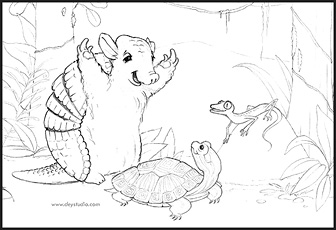
Pages 6 and 7 from a picture book, “The Rain Forest Party” written and illustrated by Lorraine Dey and available in the Fall of 2011 from Raven Tree Press.
I almost always create a pencil sketch first. Then I scan the sketch to a digital JPG file on the computer and use the sketch as a basis for painting in the color and details in layers over the sketch. Most of the work I create for istockphoto as royalty-free licensed art is done as a vector digital file. I create a large amount of work in vector style with Adobe Illustrator CS for freelance clients as well. Here is a vector chef that was commissioned by T.Marzetti Company for use on their website as well as large display signs. A vector file is scalable to any size without losing clarity therefore it was a perfect choice for this project. The style was requested by the client.

Both styles will begin as a sketch that is scanned into the computer before beginning final work on the illustration. Vector art is perfect for technical and educational work such as instructional illustrations and charts. The clean, sharp edges and ability to scale to any size make it ideal for everything from web icons to full size bill boards or vehicle graphics.
Here is a tutorial on using the Pen Tool in Adobe Illustrator… The basics of vector illustration.
Here is a quick and simple vector tutorial video…Light Ribs.
Here is a high-speed video of a raster digital painting being produced… Spider Man.
For more instruction on creating digital illustration images in various programs try a visit to Lynda.com Enjoy!
Lorraine Dey

click on image above to get a PDF file.
A resource for illustrators.
For many, the switch to digital illustration is one that takes some getting used to. One of the issues that often comes up is how to get the same natural colors which traditionally came from mixing paint colors. Here are some tips on setting up your palate for a digital painting. Also, check out this article on the differences between RGB screen color vs CMYK process print color.


I find that you really need to look closer at actual colors in small blocks. If you are painting a shadow on the snow for example, take a close look at that shadow in real life first. Remember your traditional training and get out there and do some live paint sketches. Forget for a moment what the subject is that you are looking at and look only at a small area of the object, (such as a shadow in the snow) as if you were going to match a paint swatch. You may be surprised to find out that you will have to add an awful lot of blue in there that you never thought was there. Our minds want to believe that a color should be what we think it is.

Here is a closer look at choosing colors.
If you work from photos, you can try this experiment… Grab a JPG file of any photo that you like. In Photoshop, use your eye-dropper tool to select from a small area on an object in the photo. You may have to select a few times since you may be selecting from a tiny pixel that is actually darker or lighter than the pixel next to it in the same color area. Select with the eye dropper until the color block in your tool palate shows a swatch that pretty much matches the overall look of the object. Now you have a starting point for painting in your base color for that object. Add this color to your set up palate that you are building. Select from various objects and areas of the image, filling the color blocks in your pallet until you feel you have enough colors, (digital paint) to work with.
Check out some great tips and watch illustrator Jason Seiler paint digitally in his Schoolism Class.
Below you can see the differences in color appearance between RGB and CMYK digital color especially in the greens and reds. RGB version is on the left and the CMYK version on the right.

It’s usually a good idea to set up your color palate before beginning work on a painting, (the same as in traditional painting). I create a separate pallet file and fill square blocks of color with the basic color theme I will be using. There are color swatch sample themes on websites such as Kuler But I like to create my own. Sometimes I will pick colors from a photo image that I particularly like the feel or mood of. I will use the eye dropper tool to select from various areas of the image, creating my color palate based on the color theme of the photo. Photoshop allows for you to make adjustments to your color but it will work out best if you start your painting using the colors that are as close to what you are looking for. You will want to keep in mind the end use for the image. If it will be reproduced for printing purposes such as a children’s picture book, you will want to work in CMYK mode. If you work in RGB mode on an image that will be in print, you will wind up with a completely different look to the color when you convert it later from RGB to CMYK. Avoid the surprises and start out in CMYK. Happy painting!
Lorraine Dey

click on image above to get a PDF file.
A central hub for illustration resources.

I thought I’d share a few of my favorite ways to promote children’s illustration online. You’ll want to start out with good 72 dpi JPG images of your work and a basic bio and contact info. of course.

Building a web presence… It is really best if you have a website to showcase your online portfolio. Create your own, or post your images on a free social network site or blog. It will definitely look much more professional and you are more likely to be taken seriously if you have a website of your own.
Avoid an ametuer-looking website
Start a Blog: This is a good idea if you have something to share that may benefit others. You can also start a blog of weekly illustration samples and promote it with a link to a site such as Illustration Friday which features a weekly subject to illustrate.
Show your Published and In-Progress work: I can often fit images and information into my monthly blog with examples of what I am currently working on, or news and new release information. It usually fits the topic in some way.
Social Networking Sites: Set up a page on social sites such as twitter.com, facebook.com, or LinkedIn.com for promoting your work or any new books that will be released. An industry-specific social networking site for Children’s Books is JacketFlap.com.
Join a Group: There are groups such as SCBWI that feature their members portfolio images and information on their websites, included in the membership fee. They are also a great source for regional and local events and critique groups as well as a great place for finding valuable industry information.


Advertise with Trade Websites: Childrensillustrators.com is one of the industry leaders but there are several others as well. The cost per year is minimal considering that many publishers and agents use this site and have access to your work samples. Try an online search for “Promoting Children’s Illustration”.
Cross-Promote: Add a link to your blog on your website. Include your social networking links on everything. Tweet about any updates and any news about you and your work, and include links to your blog or website in your tweets. Many of these sites like Facebook have a feature to allow you to connect your other social network sites like Twitter so you can update your posts for all your SN sites at once.
Update Your Portfolio: Try to update your work samples frequently and keep a current online portfolio of your best work. Treat your online presence as you would your actual portfolio book. Think; fewer images that focus on your individual style and your absolute best quality work.
Good Luck!

click on image above to get a PDF file.
A promotional site for Illustrators to showcase their work.
In my last post I mentioned that I had submitted my first written manuscript to the publisher. Well it looks like this year I will be starting out 2010 as an author/illustrator! Happy New Year!

Raven Tree Press has contracted my book “Hector-Armando’s Big Rain Forest Party”, (working title). It is scheduled for a Fall 2011 release and I will be spending this year creating all of the illustrations for this book about a little armadillo. I plan to keep a journal as both the author and illustrator, and will include information on the “process” in future posts. This first post is where I start working… the rough story boards and cover designs.
This means I have to come up with sketches of the scenes to be depicted on each spread and also the front and back covers. I will put the roughs together following the page sequence that they are to appear in the book. This small mini version of the book is called a book dummy or mock-up. I had been making sketches and little rough scribbles as I was writing the book. Now I need to bring it to the next level so the publisher can see what I have in mind for the entire book layout. Here’s an interesting look into the process and What Happens inside a Children’s Publishing Company.

(This is a very rough initial draft of a cover possibility and it will likely change before the final art is produced).
Here is my journaling so far for anyone interested in how this whole process looks and how long it takes…
Dec. 21, 2009 – Submitted manuscript to publisher. (This is a publisher I have already worked with. It would take much longer if you are submitting to a new publisher)
Jan. 12, 2010 – Received an email from publisher… Lorraine,
“Exciting news! People at our home offices love your book proposal. I have just gotten a green light to offer you a contract for the book and to establish a production schedule with you.”
My Schedule: The first thing I will need to focus on now is finalizing the rough story boards and book dummy. If I were to have submitted this manuscript to a publisher I never worked with before, I would have created a dummy book to submit along with the manuscript. And possibly a finished spread or two to go along with it.
Feb. 28th – Rough covers and story boards are due to the publisher
Mar. 15th – Final cover art is due to the publisher
April 15th – Final Illustrated spreads 1 – 3, (pages 3 to 7) due to publisher
Aug. 15th – Final Illustrated spreads 4 – 7, (pages 8 to 15) due to publisher
Sept. 30th – Final Illustrated spreads 8 – 11, (pages 16 to 23) due to publisher
Nov. 15th – Final illustrated spreads 12 – 16, (pages 24 to 32) due to publisher
Fall 2011 – One year later, the tentative publishing release date for “Hector-Armando’s Big Rain Forest Party”
I am very excited to illustrate my very own picture book this year. I look forward to sharing the progress with you here on my blog each month. For a look at my first illustrated picture book that I completed last year, “A Sweater for Duncan”, visit the FB fan page.

click on image above to get a PDF file.
A weekly opportunity for Illustrators to showcase their work.
Many picture book illustrators decide to try their hand at writing the manuscript as well as illustrating a picture book. I took that plunge this Fall and created a manuscript for a picture book with a working title of “Hector-Armando’s Big Rain Forest Party”.

Since this was my first attempt at writing one, I hired a development editor to help me in making sure the plot, characters, and narrative, all flowed properly. I contacted Simone Kaplan who was very easy to work with. For me, the use of an editor was crucial and in working with Simone, I gained a great deal of insight into the writing process and learned so much from her. Thank you Simone!
NOTE: I have submitted the manuscript to the publisher and will let you know as soon as I hear any news, (good or bad). Wish me luck!
There are several different types of editors you can hire to help finalize and polish your story. Since I had a particular publisher in mind when creating this manuscript, I felt that I needed to concentrate more on the actual structure of the book. A copy editor will correct things like punctuation, spelling, etc. but the publisher I am focused on already has a copy editor and so I needed to use more of a development editor for help with the foundation of the story and characters.

I came across this old SCBWI France Interview with Simone when she was still working as an editor at Harper Collins in 2001. (though I’m not sure she’ll appreciate me pulling this from the dust pile).
Here is some valuable information on getting your manuscript read and out of the publisher’s slush pile. This is a helpful article by another editor, Harold Underdown.
And here is a great article on what editor Cheryl Klein likes to see in an artist’s portfolio. Also, Cheryl has a great post on “How to write a query letter”.
Don’t be afraid to use an editor for your first manuscript. It is well worth the effort.

click on image above to get a PDF file.
Children’s Publishing information from Scot Franson.


